Timeless (and Timely) Architecture
The Interior Patriarche creates contemporary spaces—using a multi-disciplinary, human-centred approach—that function as an extension of the user.
By Andrew Waterman
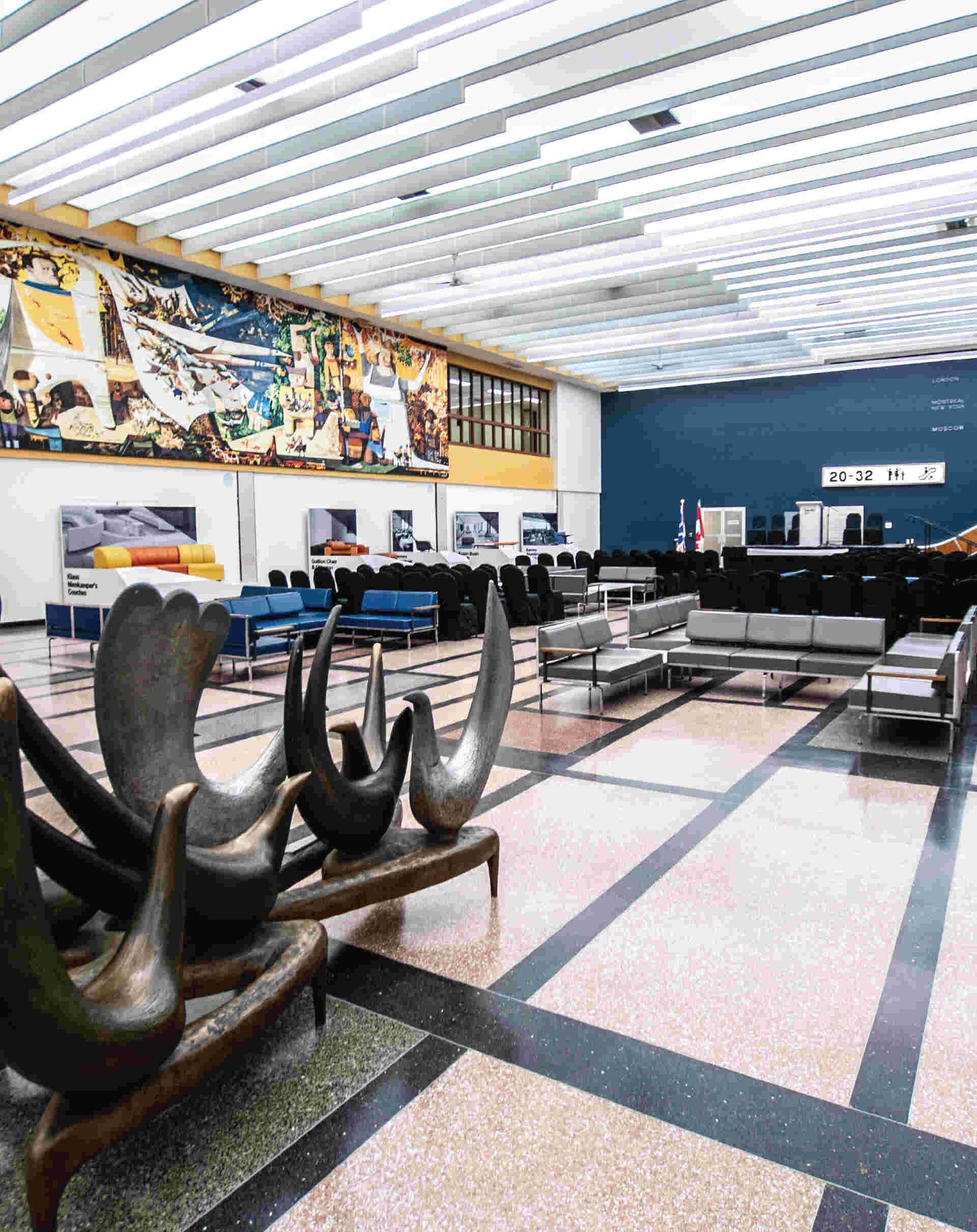
Photo by Shawn Taylor, courtesy of Gander International Airport Authority
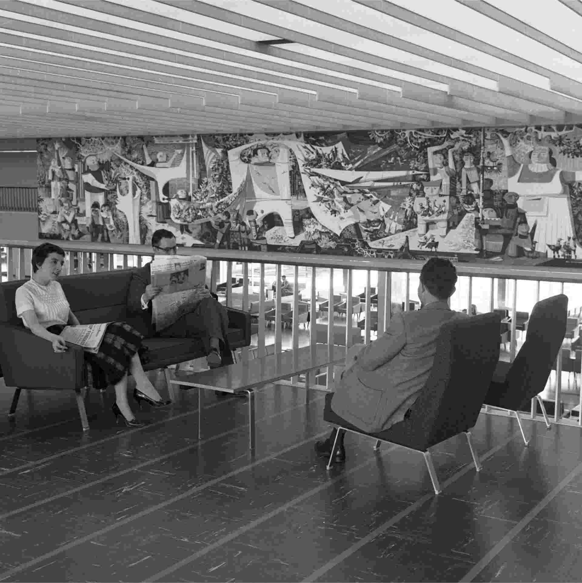
The Gander Airport International Lounge has been called one of Canada’s best-preserved modernist rooms. Both the mural, Kenneth Lochhead’s Flight and Its Allegories, and sculpture, Arthur Price’s Birds of Welcome, are rich in metaphors referencing the wonders of air travel (with nary a plane in view).
It would be difficult to overstate how unlikely the Gander Airport International Lounge is, namely because it exists in Gander—a town with a population of fewer than 12,000 that’s situated somewhere between St. John’s and Corner Brook, Newfoundland.
Since the 1970s, the only way residents of the small town could get a glimpse of the sleek furniture and 22-metre egg tempera mural by Kenneth Lochhead, titled Flight and Its Allegories, that graces the airport’s modernly appointed lounge was through a pane of glass. Visible, yet off-limits.
But after two and a half years of redesigning, repainting, reupholstering and refurbishing, the lounge finally opened to the general public in June of this year.
“The joke is that Gander is the most cosmopolitan backwater on Earth,” says Reg Wright, president and CEO of the Gander International Airport Authority.
The airport saw its first plane land in 1938 and, because of its geographic location, became the main staging point for the movement of Allied aircraft to Europe during the Second World War. It also became a refuelling stop for transoceanic traffic, necessitating the construction of a new $3-million terminal in 1959. At this time, Gander was one of the busiest international airports in the world, but by the early 1960s “jet age,” stopovers became less frequent and the airport disused.
That’s how Gander inherited an impeccably designed, world-class airport lounge. (The town and airport both saw renewed interest thanks to their role receiving airplanes and travellers diverted after the September 11 attacks, depicted in the hit musical Come From Away.)
Wright says the lounge has been a topic of conversation in the community for a long time. “We got tired of keeping it [in] a vacuum.” Hence, the $1.5-million restoration of the mezzanine and lounge, famous for its Piet Mondrian-esque terrazzo floors and mid-century furniture (much of it Canadian in origin). Now, it also houses a museum detailing the airport’s rich history. And while the area used to be enjoyed only by international travellers lucky enough to have a layover, it’s now available and accessible for wider use.
“the response has been universally good—very positive,” he says.
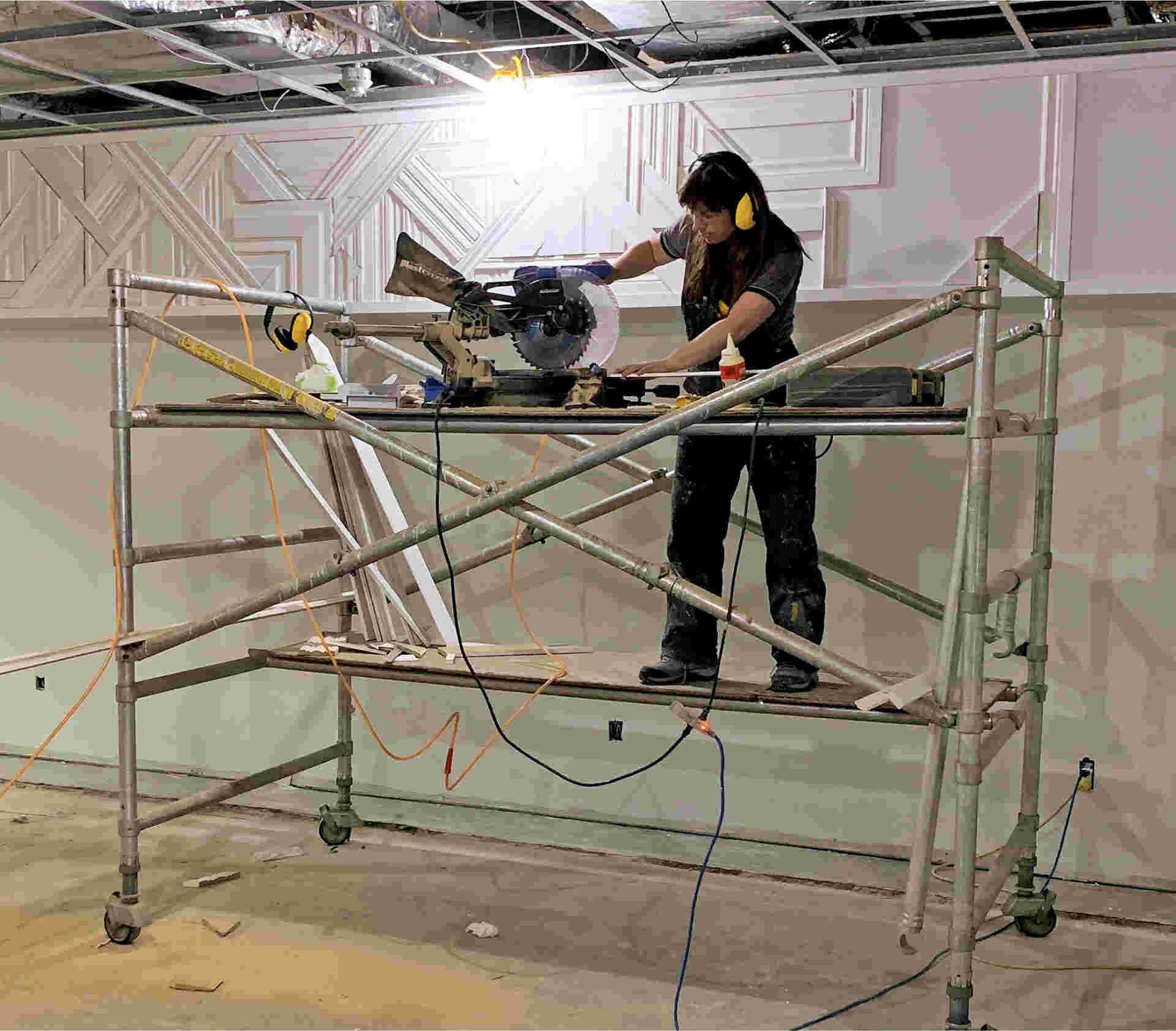
Photos courtesy of Jessica Waterman
Designer Jessica Waterman installs a custom feature made entirely of painted wood trim—these “trimscapes,” as Waterman calls them, “are reminiscent of runways and planes”
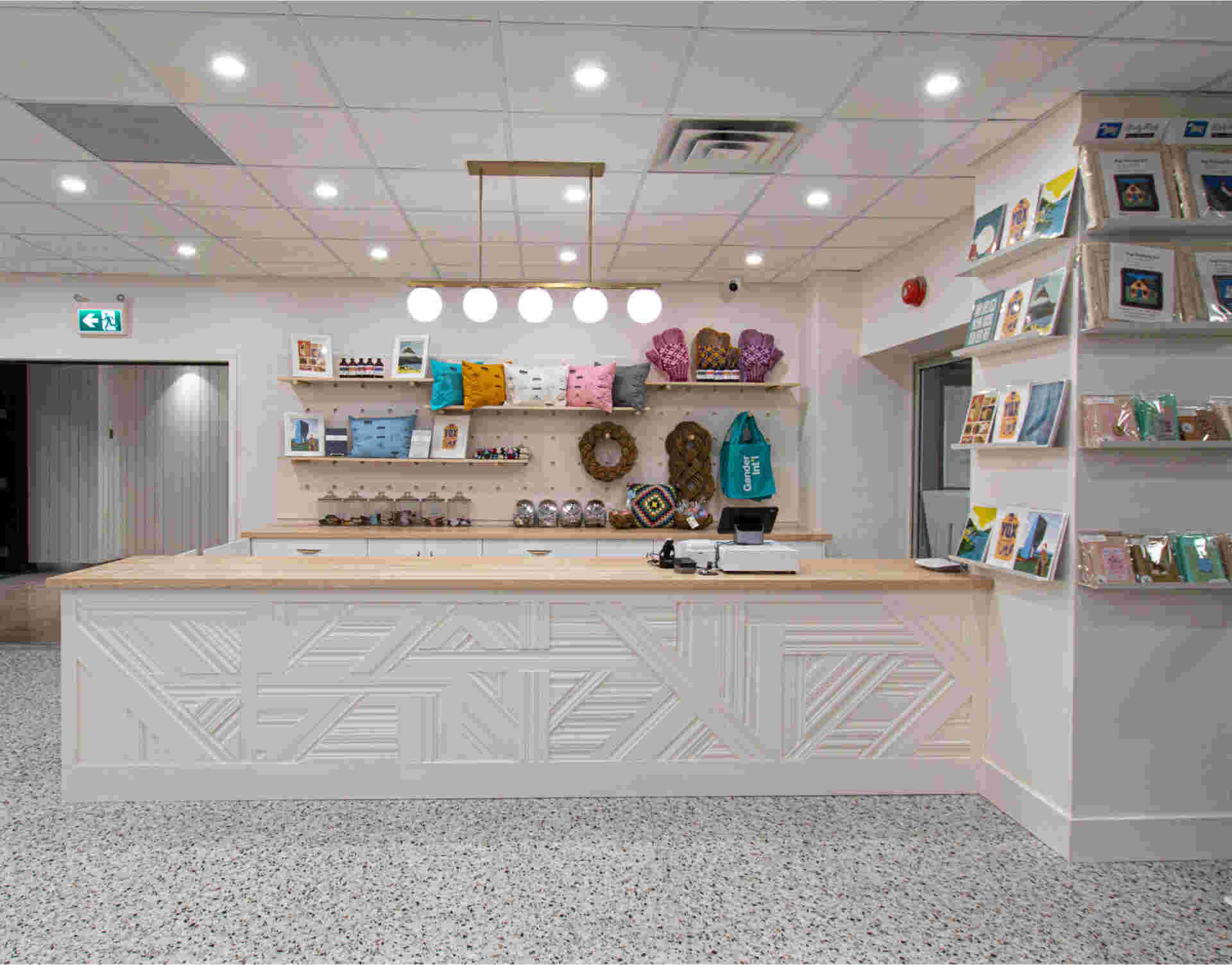
Photos courtesy of Jessica Waterman
Waterman sourced all the products—by local craftspeople from the island—for sale in the gift shop
Photos courtesy of Jessica Waterman
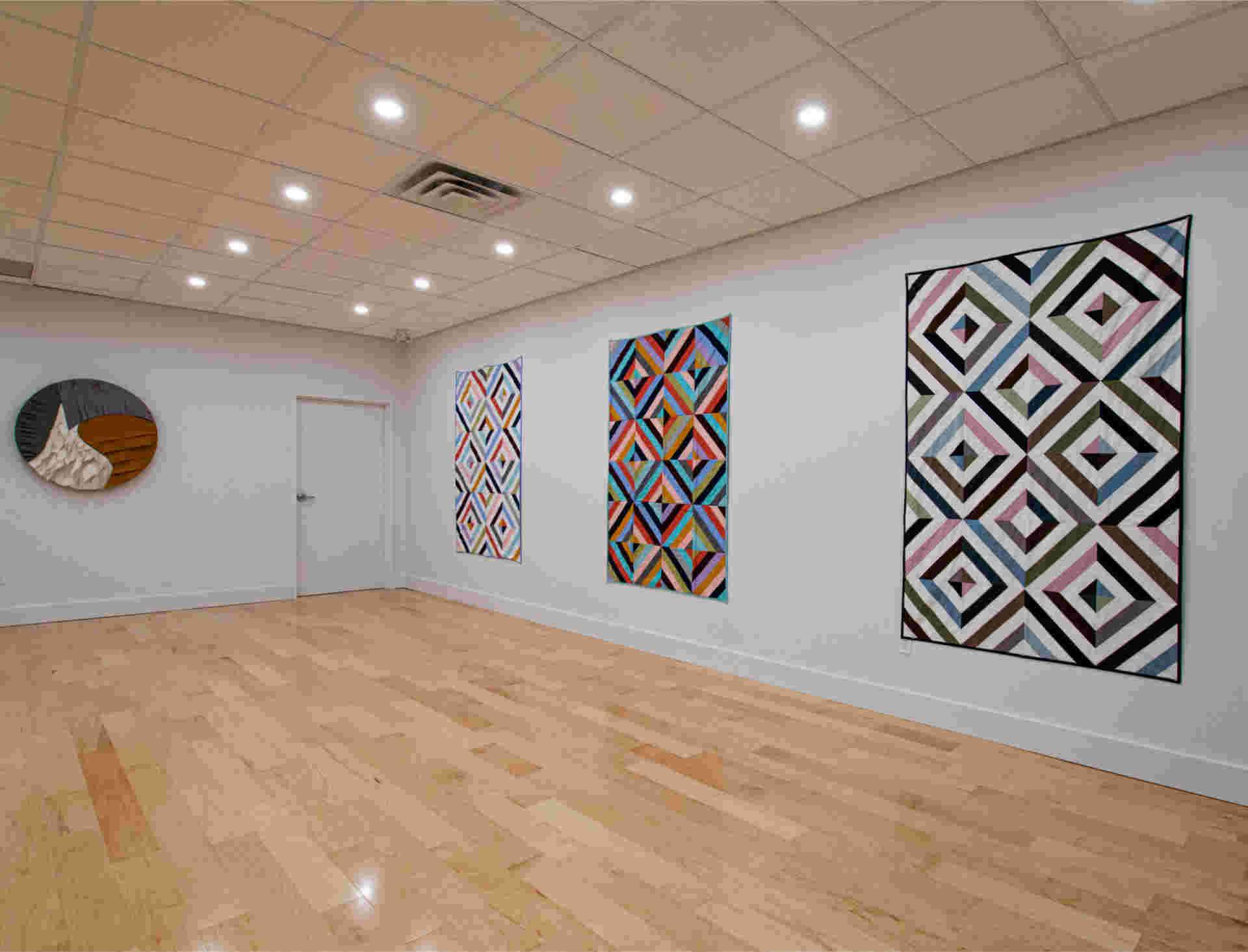
the newly built Gallery 59 displaying Waterman’s quilts and weavings.
Drawing courtesy of Jessica Waterman
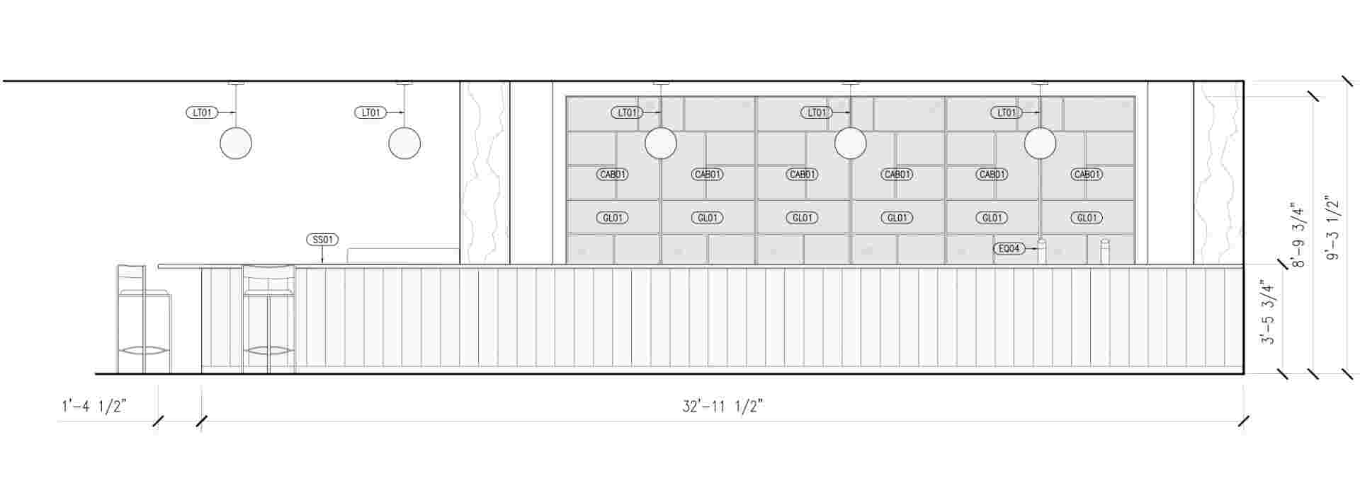
Waterman worked with Toronto-based designer Jovana Randjelovic to create elevation drawings with material and fixture specifications for the spaces.
Photos courtesy of Gander International Airport Authority
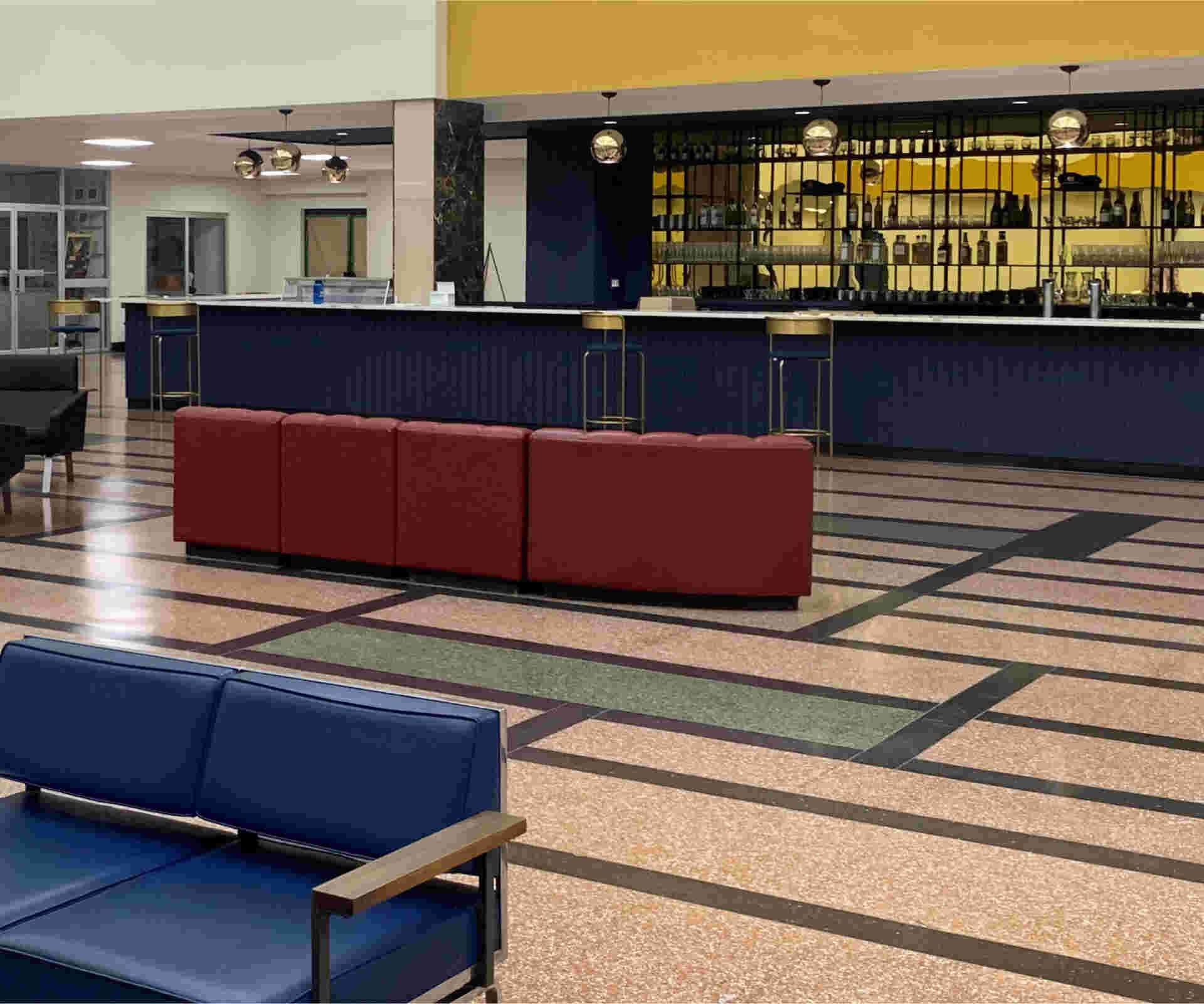
The gold-toned mirrored plexi and black shelving behind the bar reflects the historical mid-century period and patterning of the terrazzo floors.
Photos courtesy of Jessica Waterman
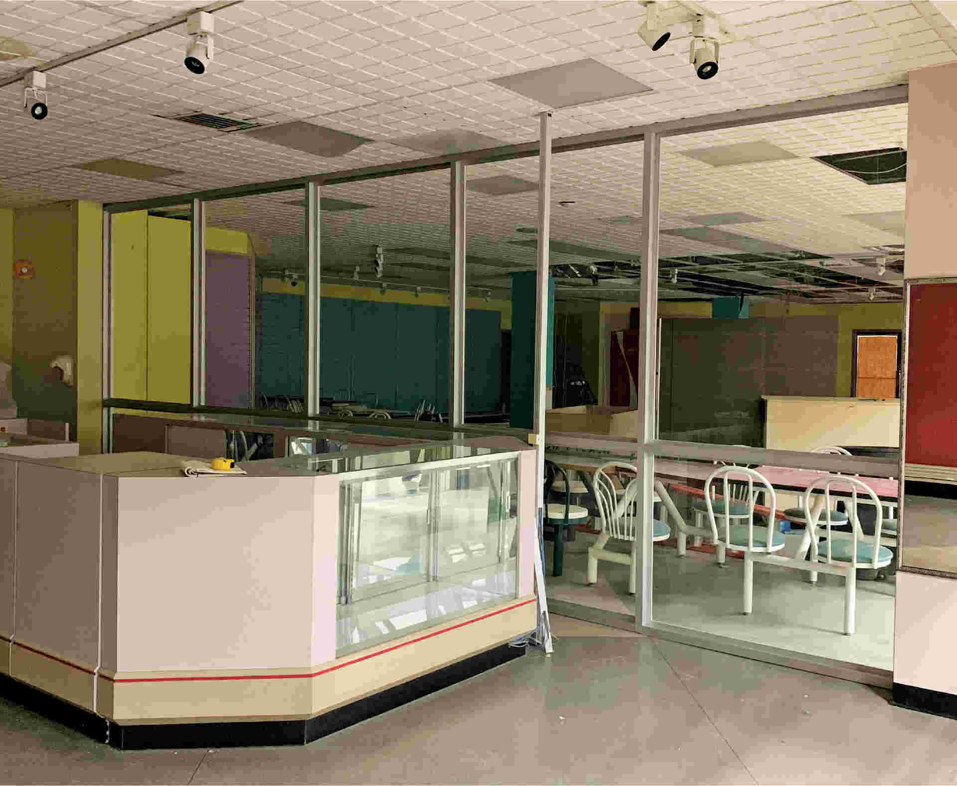
The gift shop and art gallery areas pre-renovation
Photos courtesy of Jessica Waterman
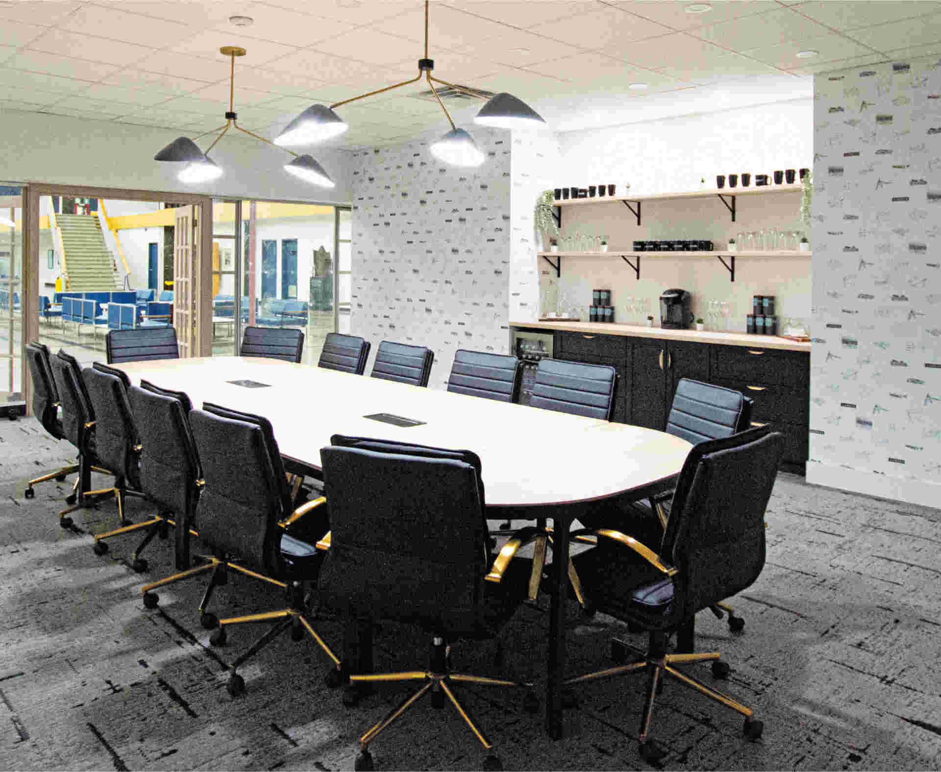
the newly built and furnished conference room, which is available for community use
Photos courtesy of Jessica Waterman
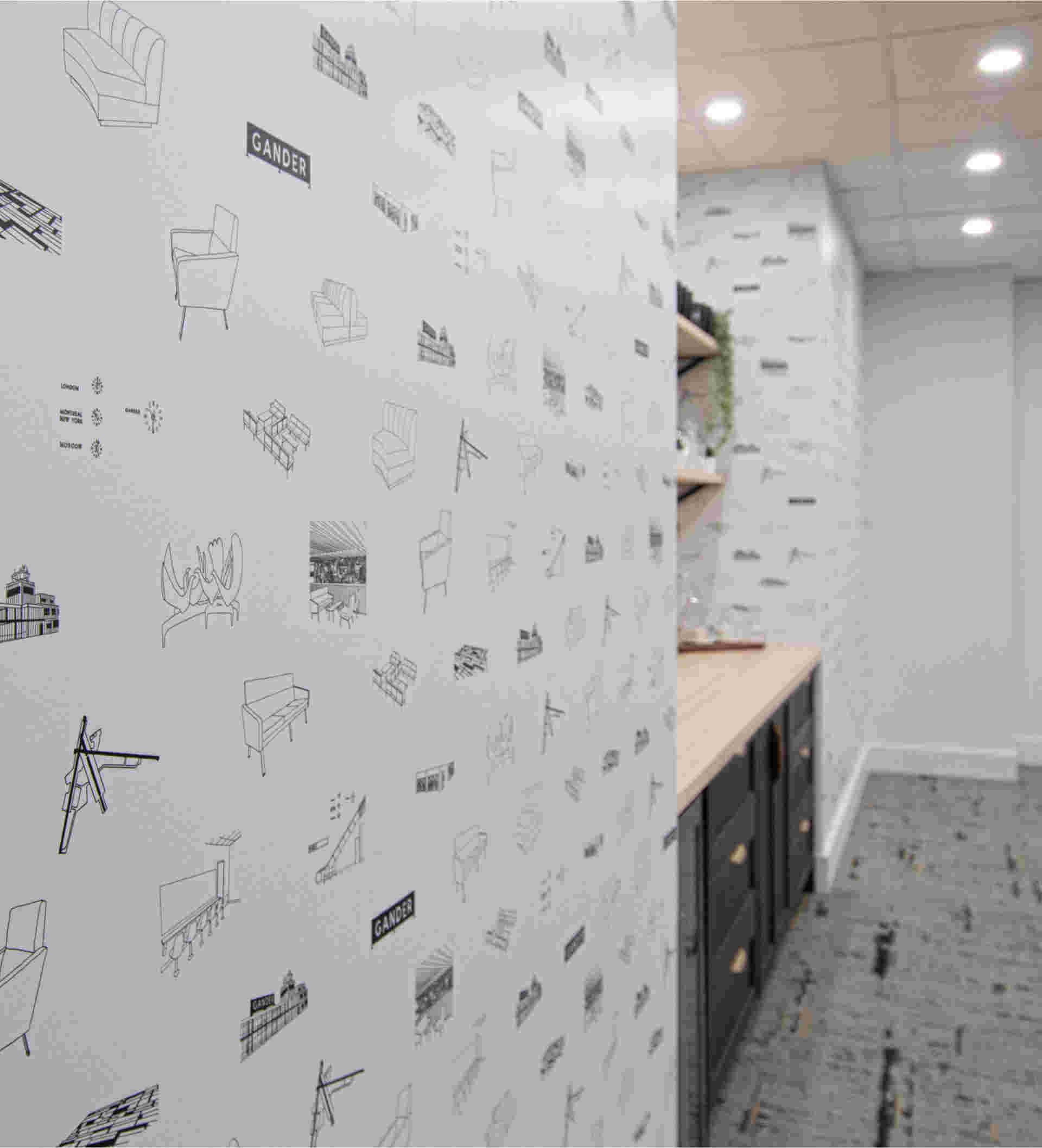
Waterman created a custom wallpaper for the conference room, featuring iconic elements of the airport, including the artworks, historical furniture and Gander sign. “If you look out the window, they’re all there,” she says
Photos from Library and Archives Canada
Travellers in 1959 enjoy a moment of respite and the view from the mezzanine. On designing the additional rooms, Waterman says: “There was no competing with this space, with the magic. [The additions] needed to be functional for today and feel fresh and new. We could have done mid-century-modern furniture, but you can’t get better than what exists out here.”
In addition, there are three new rooms—a gift shop, an art gallery and a community conference room—all conceived and built by local designer Jessica Waterman—as well as a newly designed bar. It’s in that small area, which Wright and others call one of Canada’s best-preserved modernist rooms, that royals, celebrities and countless others have spent layovers on their way from Europe to North America by plane.
The bar, however, was a project of its own. “It was a 1980s bar, totally unfunctional,” says Garrett Watton, supervisor of structural maintenance. “The old plastic booths with the fuchsia and teal colours looked awful.” Newly reupholstered in burnished tones, the bar booths have a refreshed look that’s reminiscent of the airport’s golden era.
Besides the bar, the gift shop has been completely redesigned and serves as an entrance to the lounge. Waterman designed that room from scratch, adding her clean, bright, delicate-but-sturdy style of wooden art. She also built the art gallery, where portraits of people connected to the airport (taken by German photographer Alexander Spraetz) currently hang.
In the new community conference room, Waterman’s hand-drawn wallpaper of the original Gander Airport sign is featured. It also includes renditions of the historical furniture and Arthur Price’s sculpture Birds of Welcome.
“Because the space is a bit of a time capsule . . . there [was] a big burden on the designer to come in and do things that [wouldn’t be] obtrusive,” Wright says.
Achieving that was the cause of some panic for Waterman. “The room [was] difficult because of all the colours and tones competing within the space,” she says. “We designed a new bar that looks as if it was built in 1959 with the rest, using blue paint and marble countertops that blend well with other aspects of the space.”
After beginning this project, Wright spent a good deal of time worrying about taking a step in the wrong direction and whether that would be reflected by public opinion. “Were we in a position where we couldn’t change a molecule without criticism?” he remembers wondering.
But, he says, “the response has been universally good—very positive. There’s a whole new generation getting introduced to the space.” Since opening to the public, they’ve seen about 300 visitors a day.